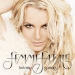
Obscure fonts and gradients. It’s like Jive wants to make it hard for us to make fanmades and themed graphics. Anyway, I like the title. It’s simple and fun, strong, flirty, etc.
Do I like the picture? Not incredibly. But may I stress that it’s better than Blackout AND Circus. Blackout, well, you know. And yes Circus was atrocious. It was a super soft-focus dainty picture of Britney, with chunky bold fonts and symbols over it in awful shades of ketchup red, mustard yellow, teal and baby blue. This Femme Fetale cover is definitely an upgrade, and something I won’t resent so much when it pops up on my iPod.
What do you think?